今天写代码的时候遇到了一个需求,想想也是觉得这个需求挺常见的,所以就写下来记一下。
需求说明:
这个需求其实很简单,就是在页面中,希望左边的一个卡片固定宽度,右边卡片自适应地撑开。这个需求其实是非常常见的,网上一搜出来的结果也很多,而我更倾向于左边卡片用浮动,右边卡片用一个左边距来撑开这种方法;具体代码如下:
<!-- demo1 -->
<!DOCTYPE html>
<html lang="en">
<head>
    <meta charset="UTF-8">
    <meta name="viewport" content="width=device-width, initial-scale=1.0">
    <meta http-equiv="X-UA-Compatible" content="ie=edge">
    <title>insteresting CSS</title>
</head>
<style>
    .contaner{
        width: 600px;
        height: 800px;
    }
    .left-panel{
        width: 200px;
        height: 100px;
        float: left;
        background: #d20e67;
        text-align: center;
        padding-top: 30px;
    }
    .right-panel{
        height: 130px;
        background-color: #19bd8e;
        margin-left: 220px;
    }
    .box{
        width: 50px;
        height: 50px;
        float: left;
        background-color: red;
        margin: 10px 10px 0 10px;
    }
</style>
<body>
    <div class="container">
        <div class="left-panel">
            <img src="logo.png" alt="">
        </div>
        <div class="right-panel">
            <div class="box"></div>
            <div class="box"></div>
            <div class="box"></div>
            <div class="box"></div>
            <div class="box"></div>
            <div class="box"></div>
            <div class="box"></div>
            <div class="box"></div>
            <div class="box"></div>
            <div class="box"></div>
            <div class="box"></div>
        </div>
    </div>
</body>
</html>
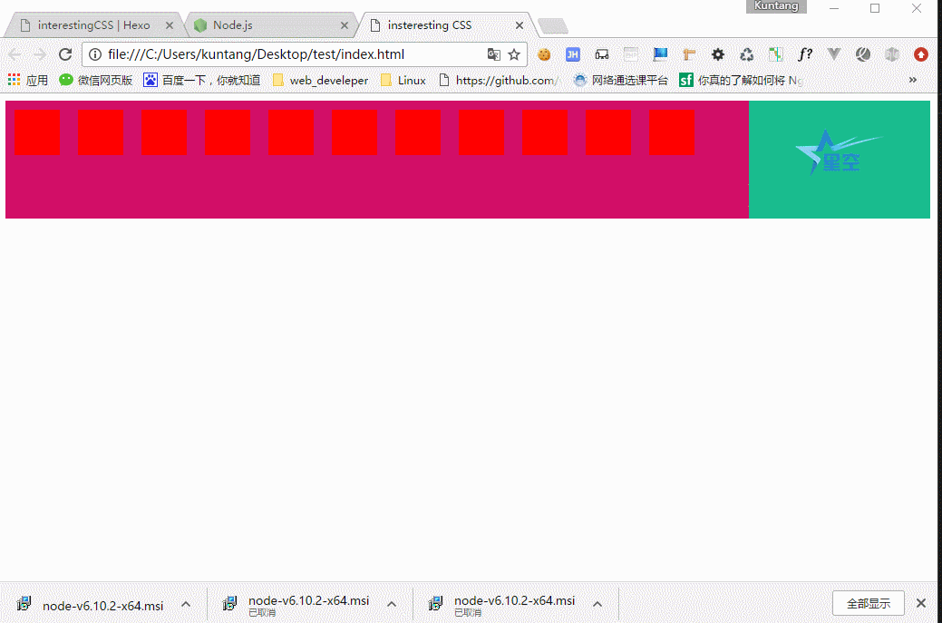
然后做成的事例大概就是这个样子:

上面的例子是利用了文档流默认是左对齐的原理,然后用flaot属性让左边的卡片脱离文档流,然后右卡片便会自适应地向左排过去,左卡片由于浮动会盖住右卡片的部分,所以右卡片用左margin来撑开使它完整地显示出来。
注意:左卡片要浮动,右卡片不要设置宽度!!
不过问题来了,如果是想要右边固定,左边自适应的话,那又应该怎么做了呢?
粗略想了一下,同样地可以利用元素脱离文档流的方法来实现这个功能,如果继续使用float属性,那得改变Html的Dom顺序,代码如下:
<!-- demo2.html -->
<!DOCTYPE html>
<html lang="en">
<head>
    <meta charset="UTF-8">
    <meta name="viewport" content="width=device-width, initial-scale=1.0">
    <meta http-equiv="X-UA-Compatible" content="ie=edge">
    <title>insteresting CSS</title>
</head>
<style>
    .contaner{
        width: 600px;
        height: 800px;
    }
    .left-panel{
        height: 100px;
        background: #d20e67;
        text-align: center;
        padding-top: 30px;
    }
    .right-panel{
        width: 200px;
        float: right;
        height: 130px;
        background-color: #19bd8e;
    }
    .box{
        width: 50px;
        height: 50px;
        float: left;
        background-color: red;
        margin: 10px 10px 0 10px;
    }
</style>
<body>
    <div class="container">
        <div class="right-panel">
            <img src="logo.png" alt="">
        </div>
        <div class="left-panel">
            <div class="box"></div>
            <div class="box"></div>
            <div class="box"></div>
            <div class="box"></div>
            <div class="box"></div>
            <div class="box"></div>
            <div class="box"></div>
            <div class="box"></div>
            <div class="box"></div>
            <div class="box"></div>
            <div class="box"></div>
        </div>
    </div>
</body>
</html>
当然,作为一个有代码洁癖的前段切图仔,虽然没有什么伟大的理想,但是对是代码质量的追求还是有的。所以对于为了页面布局而改变html代码结构顺序这种事情是不能容忍的(起码不能给自己留Bug)。所以除了用float属性外,还可以用绝对定位来使元素脱离文档流。详细代码如下:
<!-- demo3.html -->
<!DOCTYPE html>
<html lang="en">
<head>
    <meta charset="UTF-8">
    <meta name="viewport" content="width=device-width, initial-scale=1.0">
    <meta http-equiv="X-UA-Compatible" content="ie=edge">
    <title>insteresting CSS</title>
</head>
<style>
    .container{
        position: relative;
    }
    .left-panel{
        height: 130px;
        background: #d20e67;
        margin-right: 200px;
    }
    .right-panel{
        width: 200px;
        height: 110px;
        background-color: #19bd8e;
        position: absolute;
        right: 0;
        top: 0;
        padding-top: 20px;
        text-align: center;
    }
    .box{
        width: 50px;
        height: 50px;
        float: left;
        background-color: red;
        margin: 10px 10px 0 10px;
    }
</style>
<body>
    <div class="container">
        <div class="left-panel">
            <div class="box"></div>
            <div class="box"></div>
            <div class="box"></div>
            <div class="box"></div>
            <div class="box"></div>
            <div class="box"></div>
            <div class="box"></div>
            <div class="box"></div>
            <div class="box"></div>
            <div class="box"></div>
            <div class="box"></div>
        </div>
        <div class="right-panel">
            <img src="logo.png" alt="">
        </div>
    </div>
</body>
</html>
效果如下图:
Comments

CubeSuger
Think like an artist, develop like an artisan